

PARK planner is a digital tool that connects citizens and urban planning professionals to decide not only where a new park is needed, but also what type of park is most appropriate and why. Through a mobile app and a complementary web platform, it enables users to overlay territorial data layers, evaluate technical criteria, and promote community participation based on real data. This allows for informed, collaborative decisions about public space, integrating tools to assess the urban environment, regulatory requirements, and the social priorities of each neighborhood.

ROLE
UX Design, User Research, Information Design
TOOLS
Figma, Wireframing, Adobe Suite, User Interview, Research, Prototyping
DURATION
5 months
PROBLEM
In many cities, the need for a park is often identified simply by recognizing its absence, without considering what type of park is required or for what purpose. Additionally, existing urban planning tools lack intuitive access to technical data, regulatory information, and citizen participation. This results in fragmented processes, poorly contextualized decisions, and limited coordination among the stakeholders involved.
SOLUTION & OBJECTIVES
OBJETIVOS
Park Planner propone una solución dual:
-
Una app móvil donde tanto ciudadanos como planificadores pueden generar solicitudes de nuevos parques, aportando información desde sus necesidades o conocimientos técnicos.
-
Una página web complementaria, dirigida principalmente a planificadores, que permite cargar archivos técnicos, consultar mapas oficiales y acceder a normativa especializada.
-
Facilitar una planificación urbana más inclusiva y contextual.
-
Unificar criterios ciudadanos y planificadores técnicos para la creación de espacios públicos.
-
Aprovechar datos abiertos e institucionales para una visualización clara y estratégica del territorio.
-
Incentivar la participación ciudadana como detonante de transformación urbana sostenible.
User Research
To better understand the problem, I identified two key users: CITIZENS who want to transform their surroundings through the creation of a park, and technical PLANNERS who carry out this type of project. I analyzed their desires, expectations, and needs, as well as how both PLANNERS and CITIZENS engage in the creation of new parks. I conducted interviews, empathy maps, and a comparative analysis of existing platforms. I discovered that, although they share the interest in transforming their urban environment, their needs and levels of access to information are very different.
CITIZENS want to actively participate in improving their neighborhood, but face barriers such as unclear processes or lack of visibility regarding the status of their requests. On the other hand, technical PLANNERS work with scattered information and poorly integrated tools, making it difficult to make informed and well-supported decisions.
These findings highlighted the need for a tool that connects the technical with the community: a platform that facilitates strategic decision-making for PLANNERS and allows CITIZENS to participate actively, with transparency and support.
PAIN POINTS
The process of proposing a park is unclear, which limits active participation.
Guide
Planners must consult different platforms to obtain relevant data, making the analysis slow.
Information
There are no tools that connect citizen proposals with technical planning processes.
Disconnection
There is no clear guidance on what type of park is appropriate based on the urban and environmental context.
Define
Users cannot easily see the status or progress of their requests.
Traceability
PERSONA development
To approach the design of PARK planner, it was essential to understand that there are two types of users with very different needs and motivations: on one side, the CITIZENS who will use the parks (beneficiaries), and on the other, the PLANNERS, technical professionals responsible for planning and executing urban projects.
This duality of users required designing differentiated experiences both in the app and on the web platform, balancing citizen participation with the technical rigor of planning processes. Based on interviews and empathy maps, I developed two representative personas that guided decision-making throughout the project.
PLANNER – Paula is a 30-year-old urban designer working at a public agency in Bogotá. As a civil engineer with a specialization in urban design, she is committed to improving access to and the quality of public space in her city. In her daily work, she faces challenges such as the lack of tools to efficiently assess territory, the difficulty of integrating citizen participation without delaying projects, and the limited coordination between government entities.
Creating a user journey map for Paula helped identify her needs at each stage of the technical process—from identifying critical areas to the regulatory justification of a proposal. Her experience highlights the importance of a platform that allows her to overlay territorial information, explore different park typologies, and make well-informed decisions that truly benefit the community.

CITIZEN – Juan is a 49-year-old administrator who lives with his wife and teenage children in a densely populated area of Bogotá. Although his job is administrative, he has developed a strong interest in how parks influence the quality of life in his neighborhood. He is concerned about the deterioration of existing green spaces and the lack of suitable areas for family recreation.
By analyzing Juan’s user journey, I discovered that his main frustrations are related to the lack of participation in planning processes, the poor distribution of parks across the city, and the difficulty of being heard by local authorities. His case highlights the need for an accessible and clear tool that allows him to propose areas where parks are needed and understand how a request is progressing—making his experience as a CITIZEN more active and effective.

Design and Concept
The design of PARK planner was driven by the need to connect urban data, CITIZEN participation, and technical planning processes in a platform that is accessible and useful for all users. A clear information architecture was developed to distinguish between the flows of CITIZENS and PLANNERS, tailoring each experience according to their goals and level of expertise.
For CITIZENS, the interface allows them to propose new parks through a guided, visual, and intuitive process. For PLANNERS, a more technical experience was designed to facilitate data analysis, land evaluation, and evidence-based decision-making.
The visual concept balances simplicity and depth, using interactive maps, contextual filters, and comparative visualizations. The design system incorporates clear icons, user-friendly color palettes inspired by nature, and visual elements that build trust and enhance understanding. A responsive approach was also implemented to ensure the platform works optimally on both mobile and desktop devices, allowing access from anywhere.
The design aims to facilitate informed decision-making, encourage active participation, and promote the development of parks that truly respond to the needs of each community.

Iterations for Home with possible components for the website

Components

Website
Lo-fi PROTOTYPE
Low-fidelity prototypes were designed to structure the navigation flows and establish the information hierarchy of PARK Planner. Since the tool serves two distinct profiles—urban planners and citizens—the prototypes helped define a clear and specific journey for each, ensuring that the experience addressed their needs and level of technical knowledge.
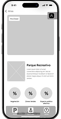
For citizens, the flow focused on making the proposal of new parks a straightforward, intuitive process, guiding them step by step from identifying the need to tracking the project. For planners, a more technical flow was designed, enabling them to analyze data, compare locations, and justify decisions based on evidence.
These prototypes allowed for the validation of the initial structure, the identification of improvement opportunities, and ensured a smooth experience before moving on to higher-fidelity design stages.
Visual cues such as progress indicators, highlighting the active stage, and informational messages were included to guide the user throughout their journey. This improves orientation and reduces friction during the use of the tool.
Visual feedback and guided navigation
In each flow, the screens prioritize the key objective: for the citizen, making the park proposal visible; for the planner, facilitating technical analysis and informed decision-making.
Focus on the main objective
Each flow was organized with informative headings, lateral or top navigation depending on the user, and a central structure focused on the main action: proposing or evaluating a new park.
Clear visual hierarchy


Low-fidelity prototypes were developed to structure the PARK planner website, designed as a complementary platform to the mobile app. Its main goal is to provide more robust tools to urban planners and entities responsible for the development of public spaces, enabling more detailed and technical work.
Unlike the initial wireframes of the app, this prototype already included consolidated visual components. Thanks to progress in building the Design System, it was possible to apply the defined typography, official logo, color palette, basic animations, and visual structures consistent with the rest of the digital product from the start. This allowed the website, even in low fidelity, to offer a more solid and representative visual experience of the final product.
The design of the website focused on facilitating the upload and consultation of specialized files, exploring existing requests through advanced filters, and accessing relevant regulatory documentation. Additionally, an informational section for new users was integrated, explaining how the tool works and its potential impact on urban planning.


The interface is closer to the final version, featuring explanatory icons, well-defined blocks, and clear navigation that supports technical work without losing the coherence of the Park Planner ecosystem.
Visual Consistency with the App
A side menu with quick access to key sections was implemented. The interface was organized into columns that separate navigation, the workspace area, and the details of the consulted content.
Technical and Functional Structure


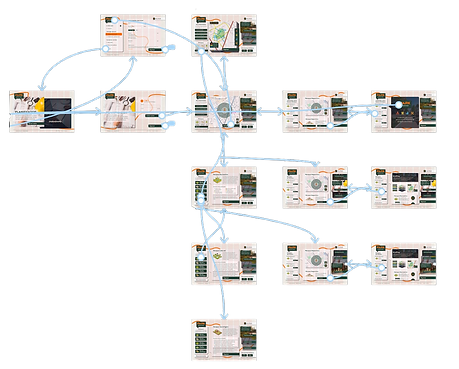
Sitemap and User Flow
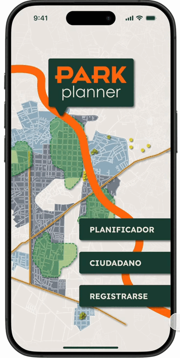
The information architecture of PARK planner was built based on the specific needs, roles, and objectives of its two main user profiles: PLANNERS and CITIZENS. The platform is divided into two complementary environments (app and website), both designed under a modular, coherent, and scalable system that ensures smooth navigation, clear hierarchy, and efficient user experience.
PARK planner App
The app is the operational core for both user profiles. It was organized with a structure that allows quick access to key actions, adapting content and interaction based on the user’s role.
PLANNER
The user flow for the PLANNER in the app is designed to optimize the planning of new parks through a guided, technical, and scalable system. After logging in, the user accesses a dashboard with clear actions that allow them to create a new project, analyze citizen requests, or review ongoing projects.
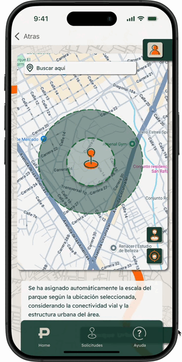
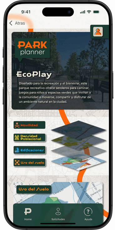
In the project creation flow, the planner starts by selecting a geographical location on an interactive map, choosing the park type automatically suggested based on the urban scale (metropolitan, urban, neighborhood, pocket park). They then customize the park according to its purpose (ecological, recreational, sports, cultural, etc.) and adjust urban variables related to regulations, mobility, density, and morphology.
The system allows the planner to overlay urban information layers, such as population density maps and land use, to make informed decisions. Finally, they can generate an automated report that will be sent for review and follow-up by regulatory entities.


CITIZEN
The flow for CITIZEN users is focused on simplifying community participation and democratizing the proposal of new parks. After registering with their personal data, the citizen can initiate a request from the main option.
The flow begins with selecting a location on the map, followed by choosing the park type and desired amenities. The system allows them to justify their request by adding comments and reasons that are relevant to the community.
Subsequently, the user can track their proposal, receive notifications about its status, and participate in interactive modules like surveys and community forums. This flow was designed to be inclusive, clear, and encourage citizen participation through an accessible mobile experience.

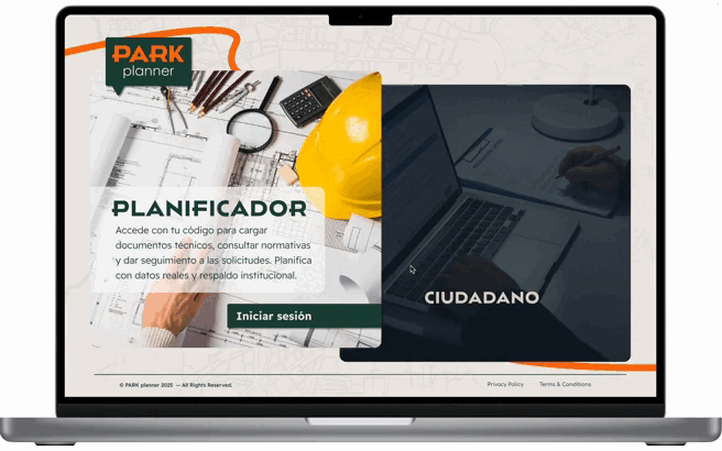
WEB PARK planner
The website complements the mobile experience by offering a more robust environment for technical consultation, document exploration, and data analysis. It also allows citizens to interact, learn more about parks, their importance, benefits, and implementation, and stay informed.
PLANNER
In the web version, the planner accesses a more robust platform with extended features for data management, file uploads, and detailed analysis. Once authenticated, they access the Planning Panel, where they can create projects or consult regulatory and technical resources.
The flow allows the upload of data from the Territorial Planning Plan (POT), environmental regulations, urban reports, and geospatial documents, linking this information with ongoing projects. They can also review citizen requests with analysis filters and add comments directly into the system.
The website is designed as a technical workspace for planners, integrating editing functionalities, collaborative documentation, and the generation of consolidated reports for institutional approval.
CITIZEN
The web flow for citizens is designed as a participatory and informative complement to the mobile experience. From the site, citizens can check the status of their request, access discussion forums, and participate in open surveys.
Additionally, they can explore collective requests on an interactive map, participate with votes or comments, and see how projects are progressing in their area. They also have access to an educational section about the benefits of parks and the role of citizens in urban planning.
The website provides transparency in the process, allows for deeper interaction, and promotes continuous follow-up through an accessible and user-friendly experience.

Usability Study
Two rounds of usability studies were conducted to evaluate the efficiency, clarity, and accessibility of PARK Planner at different prototype fidelity levels. These tests were carried out with users representative of the two main profiles: technical PLANNERS and beneficiary CITIZENS, allowing us to contrast needs, language, and expectations.
The first round focused on low-fidelity prototypes of both the app and the website, identifying friction points in the flows, critical interaction points, and adjustments in visual hierarchy. In the second round, high-fidelity prototypes with components closer to the final product were tested, assessing the understanding of advanced features such as interaction with maps and information layers, the upload of urban layers, and citizen participation.
Discoveries from Round 1
Complexity in Technical Flows
Planner users found the level of detail in project creation helpful but suggested more visual guidance to understand the logical sequence of steps (location, typology, regulations, modeling, report).
Discoveries from Round 2
Better Reception of the Layer System
Planners positively valued the integration of interactive maps and the overlay of urban data. However, they suggested more intuitive icons and an expandable legend.
Insufficient Visual Feedback
In the low-fi version, there were no clear visual indicators confirming completed actions, such as submitting a request or moving to the next step in the planning flow.
Interest in Predictive Visualizations
Planners expressed that a feature for simulating visual impact or automatic estimates for traffic flow, vegetation, or public services would add significant value.
Technical Language Not Easily Accessible
Citizen beneficiaries noted that some urban or geospatial terms were unclear, limiting their understanding and autonomy when requesting new parks.
Need for Visual Customization
Users emphasized the need for the platform to allow customization of the interface for different contexts (e.g., rural vs. urban) to improve the relevance of design decisions.
Style Guide
The style guide for PARK Planner was designed to evoke the technical, structured, and precise nature of urban planning processes, with an aesthetic inspired by architecture and engineering. The color palette conveys professionalism, structure, and action: the dark green #1B463B is used as the primary color for titles, text, and key buttons, projecting stability and depth. As a complementary and high-contrast color, the vibrant orange #FF720D is used in lines and key words.
The overall background is a light neutral tone #EEEAE4, upon which a map line of Duitama (Colombia), the city chosen for the prototypes, is displayed. This map provides territorial context and visually connects the user to the real environment. Additionally, the design uses shadows and overlapping planes to divide sections, simulating the logic of layers in technical plans.
Typography also plays a crucial role in the visual identity: Houstone Expanded is used for titles due to its strong visual presence and sense of horizontal progression, evoking the dynamism of flows within the app. For the body text, Reader Pro is employed, a technical stroke typeface that balances precision with legibility, ideal for representing urban and data-driven content.
The icons follow a continuous line style and flat shapes, resembling the strokes of an architectural plan, reinforcing the notion of technical reading. Finally, transitions and animations were designed to simulate the change of layers or plans, similar to when an engineer reviews different sections of a project: a visual gesture that reinforces the structure of the system and allows the user to "read" the urban space from different dimensions.

hi-fi Prototype
After implementing the learnings from the usability study rounds, the high-fidelity prototype of PARK Planner was developed, consolidating visual, structural, and interactive improvements for both the app and the website. The iterations focused on reinforcing the visual hierarchy, facilitating navigation between technical and citizen sections, and optimizing the flows based on the user's profile (PLANNER or CITIZEN).
All components from the visual system defined in the style guide were integrated: typography, colors, technical iconography, background urban maps, and microinteractions simulating the change of plans, reinforcing the visual metaphor of urban projects. Buttons and cards were refined to provide immediate visual feedback, while transitions simulate overlapping layers, just as in the technical reading of plans.
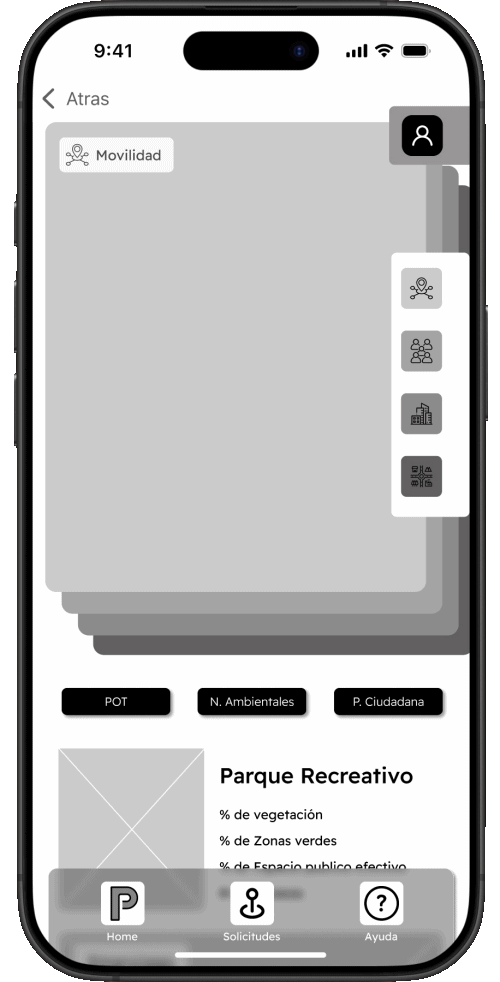
In the mobile app, the flows for both the technical planning of new parks and citizen requests were refined, highlighting key features such as the interactive map with urban layers, the selection of park typology, regulatory analysis, and the upload of georeferenced information.
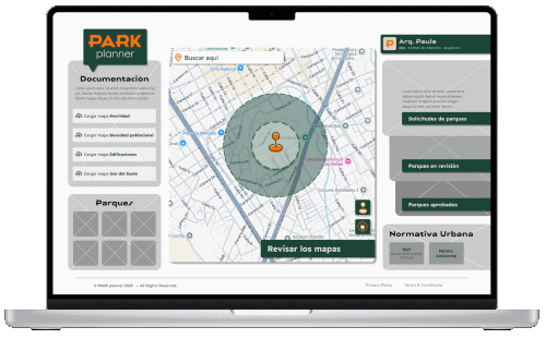
In the web version, specifically designed for the expert profile, emphasis was placed on access to technical resources, regulatory libraries, and detailed tracking of citizen requests with a more structured, visually clear approach aligned with urban planning processes.
This high-fidelity prototype allows for a more realistic simulation of the full navigation experience, facilitating the final validation of the interface design, content structure, and key flow behavior. Its outcome reinforces PARK Planner's vision as a technical yet accessible tool, combining institutional precision with active citizen participation.

Intuitive and Hierarchical Navigation
Both in the app and the web, the information architecture is designed to guide the user in a smooth and clear manner, differentiating navigation flows according to their profile. The structure prioritizes key tasks such as creating a request, exploring park typologies, or checking statuses, using a clear visual hierarchy and a menu system that is always accessible.
Interactive Map with Urban Layers
The visual core of the experience is a city map that allows users to visualize their environment, identify potential park locations, and overlay layers such as population density, accessibility, or green coverage. This tool helps to better substantiate each request and make informed decisions about urban space use.
Role-Specific Flows
PARK Planner has user flows designed specifically for citizens and planners. The citizen flow is direct, assisted, and uses simple language, while the technical flow is geared towards expert users, offering full control over data, advanced filters, and document upload options.
Responsive and Scalable Design
The platform is fully adapted for a seamless experience on both mobile and desktop devices. The app enables on-the-ground requests, while the web enhances technical and collaborative work among teams. Both versions share an aesthetic based on plans, layers, and urban lines, conveying a consistent identity.

Functional Interactions
Each component includes subtle animations that evoke the transition between architectural or engineering plans. These microinteractions allow users to identify key actions, confirm their progress, and explore the system with a sense of solidity and professionalism, without sacrificing accessibility.
Intuitive and Hierarchical Navigation
Both in the app and the web, the information architecture is designed to guide the user smoothly and clearly, differentiating navigation flows according to their profile. The structure prioritizes key tasks such as creating a request, exploring park typologies, or checking statuses, using a clear visual hierarchy and a menu system that is accessible at all times.

Accessibility Considerations
Alt Text and Semantics for Screen Readers
All line icons, interactive buttons, and relevant visual elements include descriptive labels (alt text) to ensure compatibility with assistive technologies. This allows users with visual impairments or those using screen readers to navigate the entire platform without missing critical information.
High Contrast and Clear Visual Hierarchy
The combination of a neutral background (#EEEAE4), dark green text (#1B463B), and vibrant orange accents (#FF720D) ensures readability across various levels of vision. A strong visual hierarchy was implemented through typography size, weight, and color use, helping users understand each section—even under low-vision conditions.
Immediate Visual Feedback
Each time a request is created or edited, users receive immediate feedback through confirmation messages, microanimations, and visual changes in buttons and fields. This feedback provides reassurance and reduces errors during critical actions such as uploading technical documents or selecting urban layers.
